


Instagram Embraces iOS 7 Specific Specific Design Lines
In the latest update of the popular app, Instagram aligns its design elements in iOS 7.
Immediately after the launch of Apple’s iOS 7 of last week many application developers flocked to update their applications. Given that the Cupertino giant has adopted some design concepts completely different from those used in the past seven years, programmers have to align same lines of their creations. Facebook and several programs have been updated nearly the same evening, Instagram is part of the second wave of updates that come with significant changes in the functionality and aesthetics.
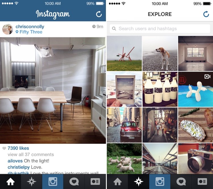
First, the appearance of the plane interface, characteristic iOS 7 and dominant of white color as you can see in the picture above of Instagram. With a clear focus on simplicity and clarity, even if the important buttons have not changed their position, the entire interface seems more intuitive. Photos are larger and clearer due to increased resolution and video clips will also benefit from an improved quality. Width occupied by the images feed now goes from edge to edge, one of the many changes designed to facilitate the consumption of multimedia content. If the entire interface of iOS 7 comes with profile pictures round the same convention makes its presence felt in Instagram.
Altogether, the final outcome of the Instagram version 4.2 is summarized well on the company blog. The new application is, clear, simple and grounded. The only element that has not changed is the icon. If you hurry and do not have it already installed, you can download it now from the Apple AppStore.