


Top 18 iPhone App Design Inspiration For 2012 That Really Rocks
This is a guest post by +Tope who is Vault Overseer at App Design Vault where you get stunning iPhone App Design templates for developers with a budget or lack of good design contacts.
This app was Apple’s Top App of 2011. So why not start with that. It has a nice custom Navigation bar and a Photo gallery. The design of the App is minimal without all the flashy graphics you may see in some other apps. This goes a long way to say less is more.
HBO Go.
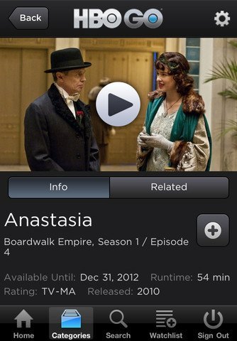
This App from HBO debuted as number 3 in the Apple Rewind Charts. It has a dark theme with custom buttons. You can also see a custom Segmented control in the screenshot above as well as a custom Navigation Bar with the HBO Logo. Dark themes tend to do well on media apps like music players, cinema listings etc.
Crackle

Crackle is also a media app like HBO Go and does well with a dark theme. This was number 3 on the Apple Rewind 2011 Charts. It just goes to say Apple likes apps with great design even if it is a custom one. Check out the grunge texture on the Table View background, sweet 🙂
Starbucks
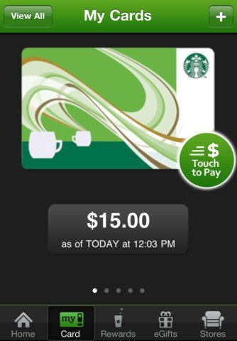
The Starbucks app completed 26 million transactions in 2011. Not bad for an app that sells coffee, huh? This app features a custom Tab Bar Controller with custom icons. In iOS 5, it is now easy to customise your Tab Bar design. Previously, it was a pain because you had to swizzle your own controls.
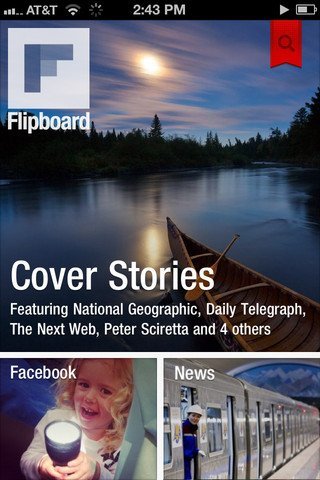
It doesn’t get more minimalistic than Flipboard. I was a Flipboard addict on the iPad until this app was released. It had 1 million downloads in the first week of launch alone. This app uses a cool technique I would call Chameleon :-). It uses the images of the news item prominently and hardly has its own controls. This means the app looks different every time you open it. The news of the day determines how your own Flipboard will look like.
If you want to design your own apps to look like the Flipboard app, check out this iPhone App design template which gives you a similar look and feel.
Super 8
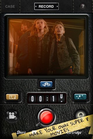
From minimalistic to over the top, Super 8 uses a lot of textures to adorn the app. There are almost no Apple default controls left in the app. It has glossy red buttons, number ticker controls and beveled buttons.
What stands out in that screenshot is the leather texture. Leather is in vogue right now. A good example is the Find My Friends app from Apple. Here are two leather texture templates you can use for your own apps. Foody Recipe App Design and PodRadio – Multimedia App Design
Nike Training Club
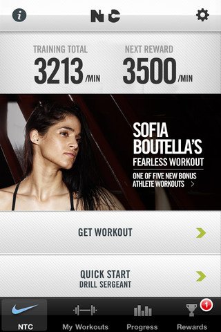
I’m loving the design on this app. This shows you can use UILabel controls to make your app stand out. All it takes is to use the correct font and the size in the correct places. Of course, the image of the hot lady doesn’t hurt 🙂
Kayak
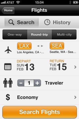
The Kayak App was Time/CNN’s top travel app of 2011. The design uses a lot of shadows to add depth to the app. It heavily uses UILabels in different sizes. It draws your attention to the important information by using larger fonts.
TED
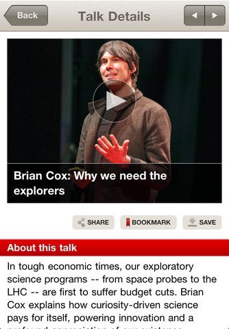
The TED app is one multimedia app that doesn’t use a dark theme, but does it well. The play button on the video players makes it have a minimalist design. This app uses the default Apple Navigation bar with a different tint colour. You don’t always have to go custom
Epicurious
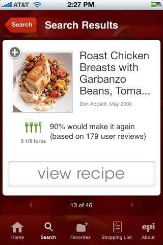
Recipe apps are hot stuff. Not in the tongue-burning sense but in the money sense. People love having recipes on the go, that is why you will see top chefs releasing their recipe apps. Epicurious has a bright design with a red textured background. The navigation bar is obviously customized. Going into 2012, this will become the trend. The app also makes use of framed images and text to complete the design
Jamie’s Recipes
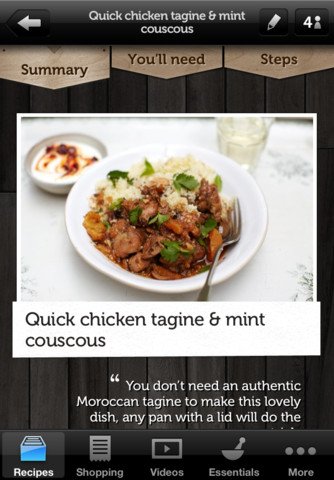
What did I say about Chefs releasing recipe apps? Well, Jamie is proof of that. Apart from leather, wood designs were a hit in 2011 and will continue to be a hit going into 2012. In this app, you have a framed image complete with a wooden navigation element and a wood background texture. So believable, it looks like it was cut out of a real oak tree in Cameroon.:-)
If you want videos on how to design such apps, check out the videos on Tapptics
Momento
I love this app. Seriously, I know I have said that before, but I own this app and it is always a joy to open it and use. This is one of those apps that just makes you smile while using it, just by seeing the subtle design elements that you know someone took a lot of time to design. Amazing design, you have got to get it. Okay, I will stop drooling now.
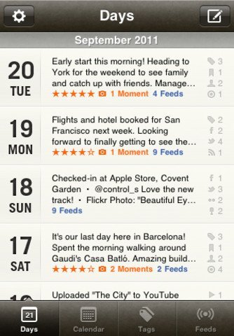
On this day
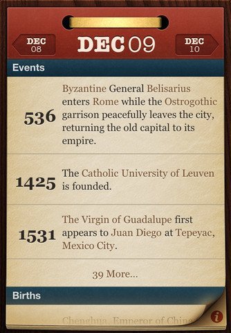
This is another app that takes design to another level. If you look at the array of apps that Sophie has designed, you will obviously see that she has a passion for doing this stuff.
The app has an old grunge paper texture that makes your iPhone look like it was made in the 1930s. Apart from the paper texture and the amazing navigation bar, the rest of the app is minimalistic with just labels and fonts in different sizes and colours.
Very well done.
On this day
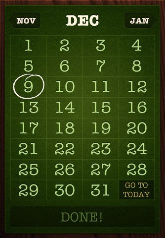
This app is so well designed, it warrants another entry. Check out that calendar screen. Enough said.
Groceries
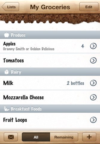
Here is another wood themed design. The design has a custom navigation bar with a torn paper background for the main view. Nice combination.
Grades 2
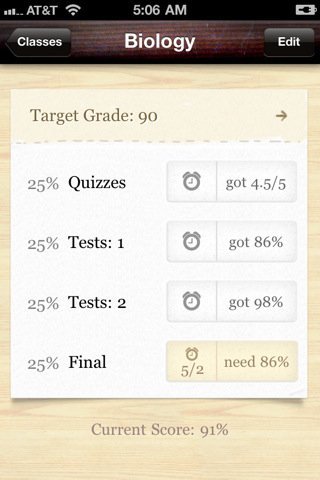
Wood again? I told you wood is a hot design element. Grades uses it in both its icon and in the app. In the app, it also has two different types of wood textures. The navigation red texture and the background brown texture. If you want to templates that can help you achieve a wood design, check out Photoly – Photography App Design
Toca Hair Salon
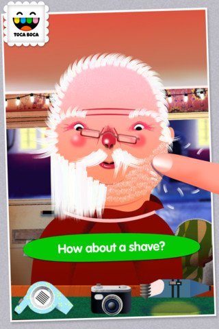
Toca hair salon is Apple Top Entertainment App for 2011. it has lots of colourful artwork and probably written in OpenGL. Be careful, it can be addictive.
Yearly
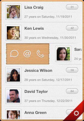
Yearly helps you remember birthdays. Now my mum will not be pissed off anymore because every year I forget her birthday. I now have a beautiful app to store that information. The design is minimalistic but not minimalistic, if you know what I mean. There are only two colours in that screen, gray and brown. They are used in multiple shades and that is what makes it stand out.
Pimp Your Apps in 2012!
From these examples, it is obvious you need a great design to give your apps that extra edge over others in your category. Do not make it an after-thought but embed it early on when you are drawing out a concept. And if you need some inspiration or lack the design skills, check out some iPhone App design templates here.
Have a great 2012 with lots of downloads!.